Hi, I’m Ola

I design, build and ship products
people enjoy using, from idea to launch.

About me

  • Product Designer
  • Design Engineer
  • AI-native product builder

I design, build and ship, and I close the gap between the two ends. AI runs through my whole workflow, so a product moves from first sketch to live release in a fraction of the usual time, and what reaches your users is exactly what was designed. Ready to start your next project?

Design. Build. Ship.

One person across all three, with AI speeding up every step, so nothing gets lost between the idea and the launch.

Portrait of Ola
Let’s talk about
your product
  • Design. Research, flows, interface and motion, shaped around the people who will use the product.

  • Build. I build the whole product, with AI in my workflow, so working software arrives in days and the details survive.

  • Ship. I see it through a secure release, then keep improving it. I’m a Test IO verified cyber security tester.

Work

Designed, built and shipped

Live products I took from the first sketch to production, moving fast with AI in my workflow, and concepts where I push a brand somewhere new. Open a project to explore its screens and how it was made.

Experience

Brands I’ve helped shape

Identity, product and launch work for teams who wanted a brand that holds up from the first logo to the shipped product.

Book a call
Contact

Let’s design, build and ship your next product.

Two quick questions and a way to reach you. It takes under a minute.
  1. 1Your project
  2. 2Your details
  3. 3Sent

Got a project in mind?

What do you need?

Where can I reach you?

Thank you. It’s on its way.

I’ll reply to soon.

Beaches & Boats app

iPhone and Android app, in testing

In testing

The Beaches & Boats app brings the beach-stay and boat marketplace I designed and built for the web to iPhone and Android. I’m designing it, building it and running it on the same backend as the website, and it’s in testing now.

My role
Product design, app engineering, backend
Platform
iPhone and Android
Status
In testing
The splash screen with the Beaches and Boats wordmark
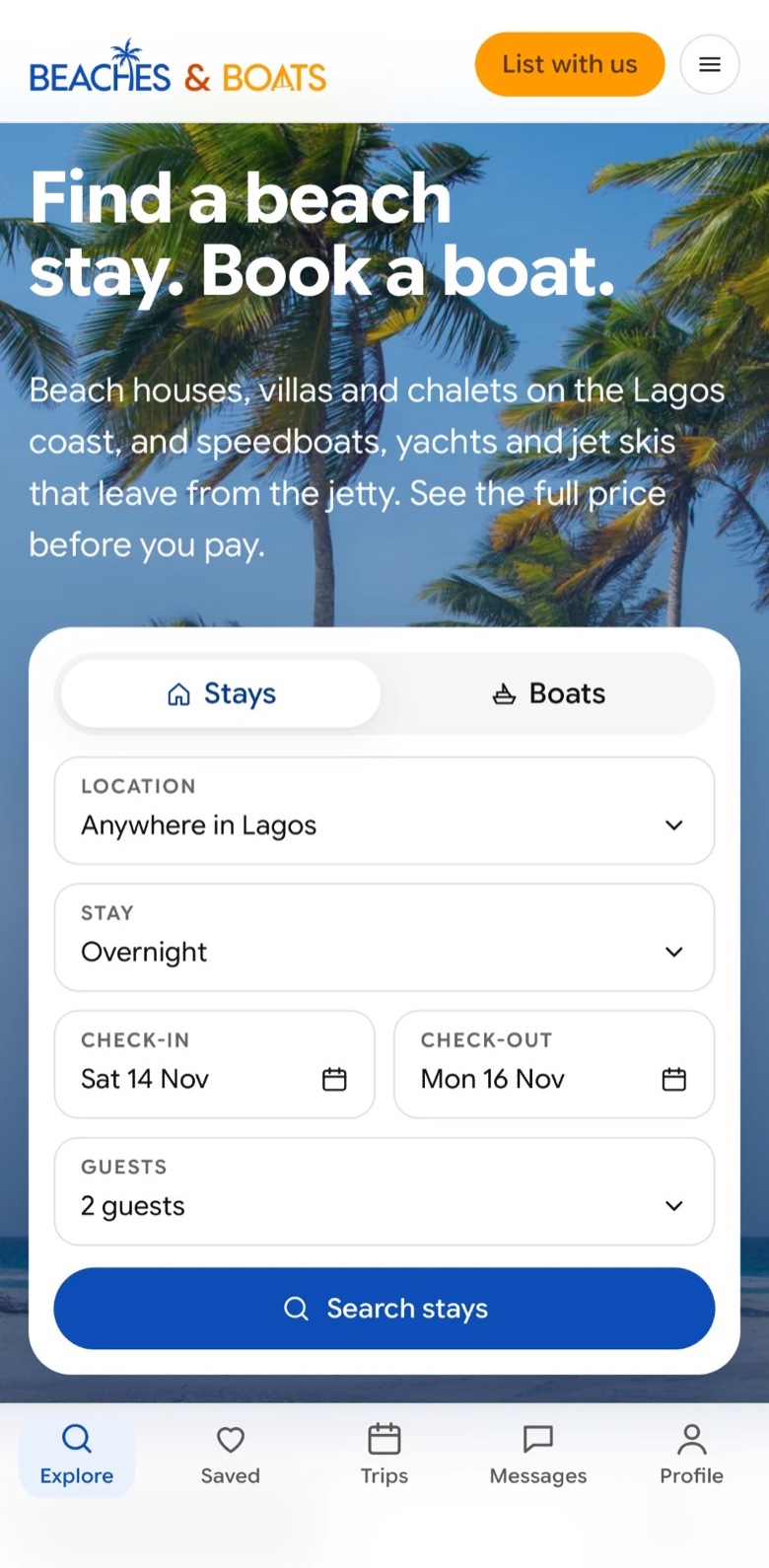
Explore: featured stays and boats under a search bar
A listing: Driftwood Beach House with tags, details and a Reserve bar
All photos of a listing in a sheet
Built with
  • Cross-platform app
  • Secure cloud backend
  • Native sign-in
  • Maps
  • Real-time messaging
  • Automated testing

UI/UX

I designed it around one journey: from “where should we go this weekend?” to a confirmed booking. Explore opens on the coast, with stays and boats side by side, so the first decision is easy. A listing answers the questions people actually ask, who it sleeps, how you get there, what it really costs, before they have to scroll, and the full price and Reserve stay in reach the whole time. Photos open in a sheet you can flick away, and you can save a place without signing in, so nothing interrupts the decision.

Front end

Built once for iPhone and Android, with its own design system so every screen feels native and consistent. Gestures, sheets and motion follow what people expect from a phone, and every change is tested before it reaches a release.

Backend

The app shares a secure backend with the website, so listings, bookings and messages stay in step everywhere. Every request is checked, sign-in is native, and private data stays protected on the device and in the cloud.

AI in the workflow

AI is part of every step: turning designs into Flutter screens, writing tests and database functions, and keeping the documentation current. I make the product and security decisions and review every change, so the build moves at the speed of those decisions. That is how the app went from an empty project to its main journeys in three days.

What this project shows

  • Web to native, end to endI can carry a product from the website to a native app myself, on one backend, with one design language.
  • Security by defaultClosed tables, checked functions, secrets kept off the device, and a separate staging world for every test.
  • Speed without shortcutsAI makes the work fast; tests, CI and written decisions keep it sound.

Deebo

Events ticketing platform

Visit site

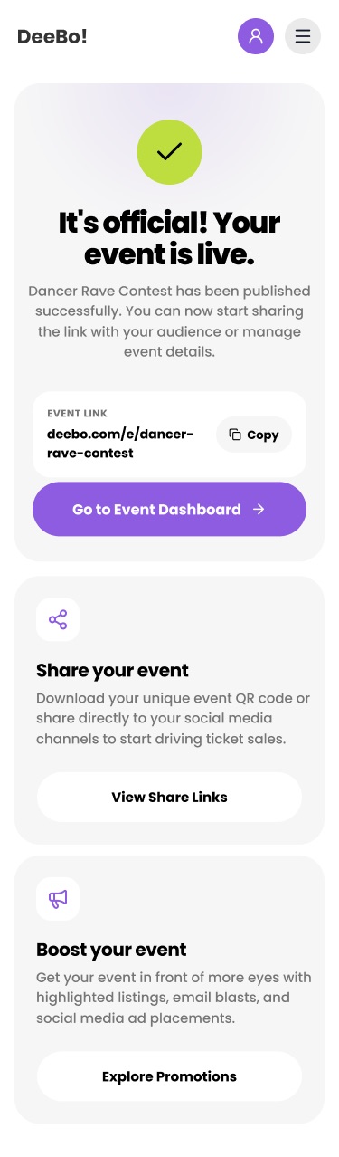
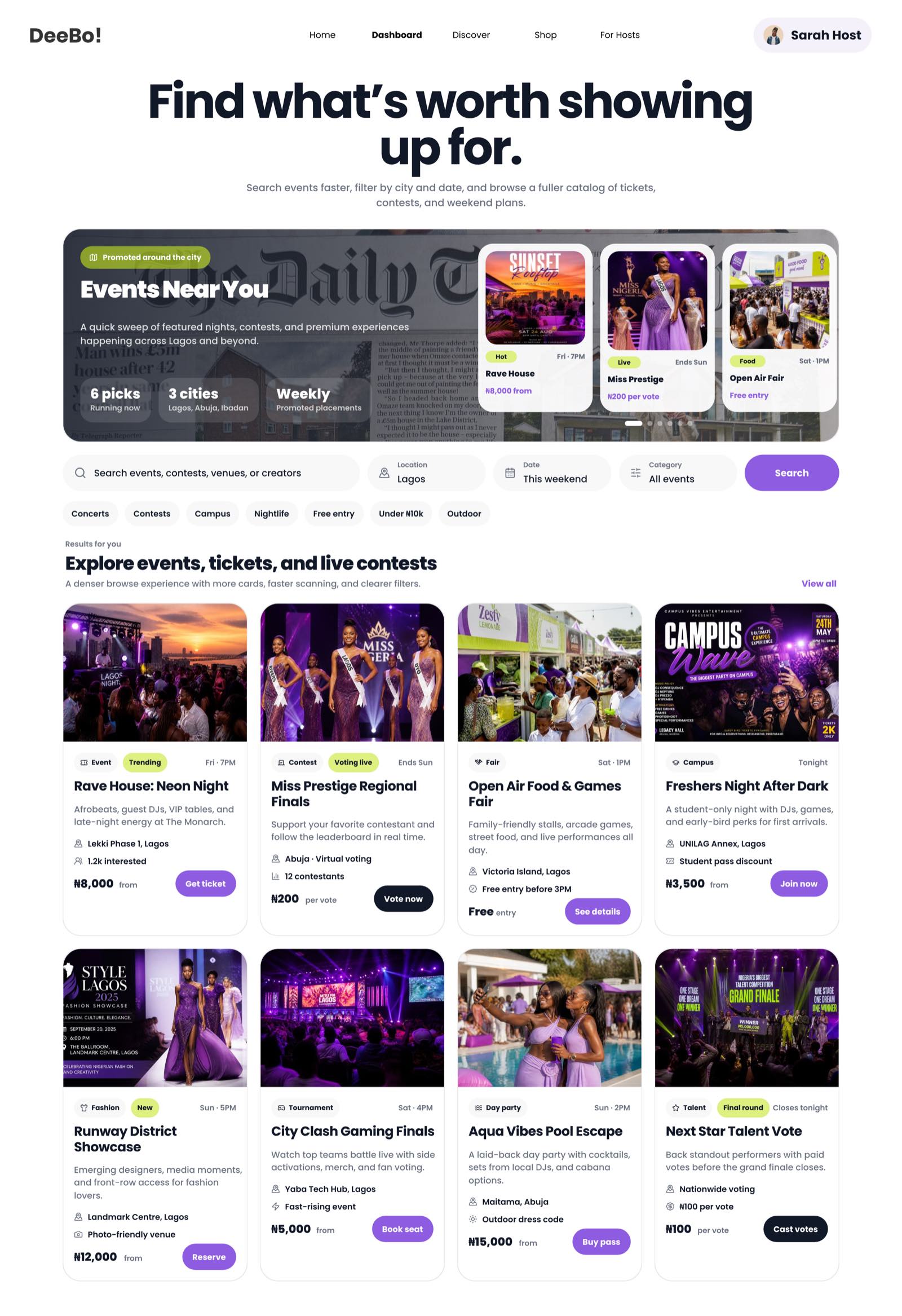
Swipe or use the arrows to change page. Scroll inside the screen to explore. The events shown are sample data.

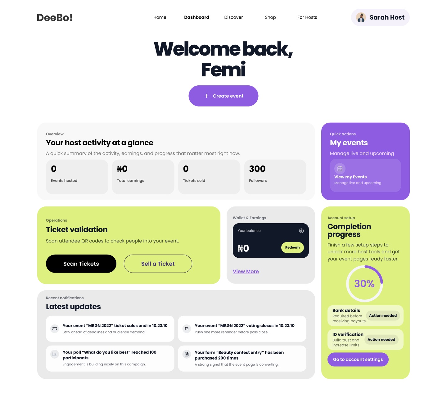
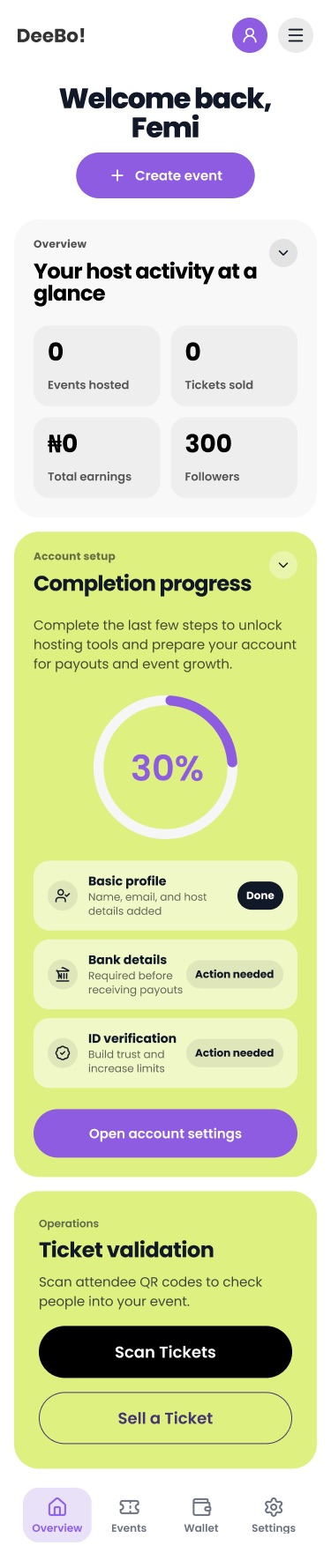
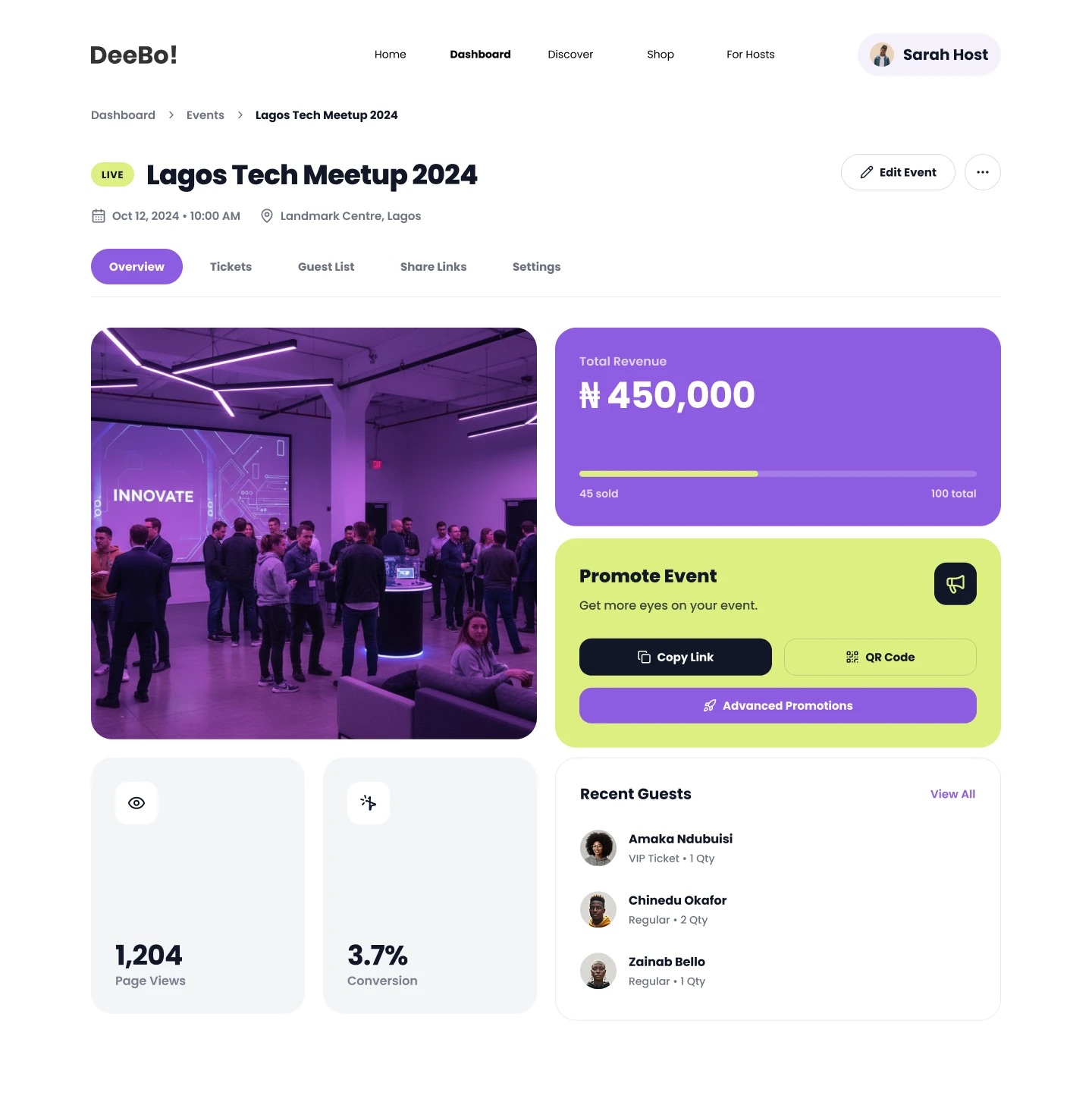
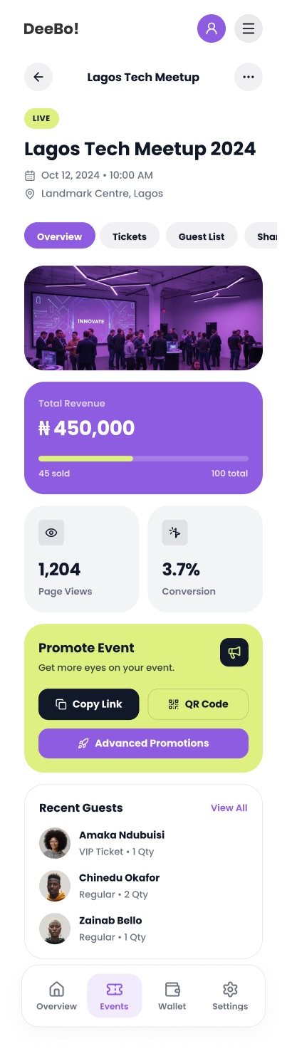
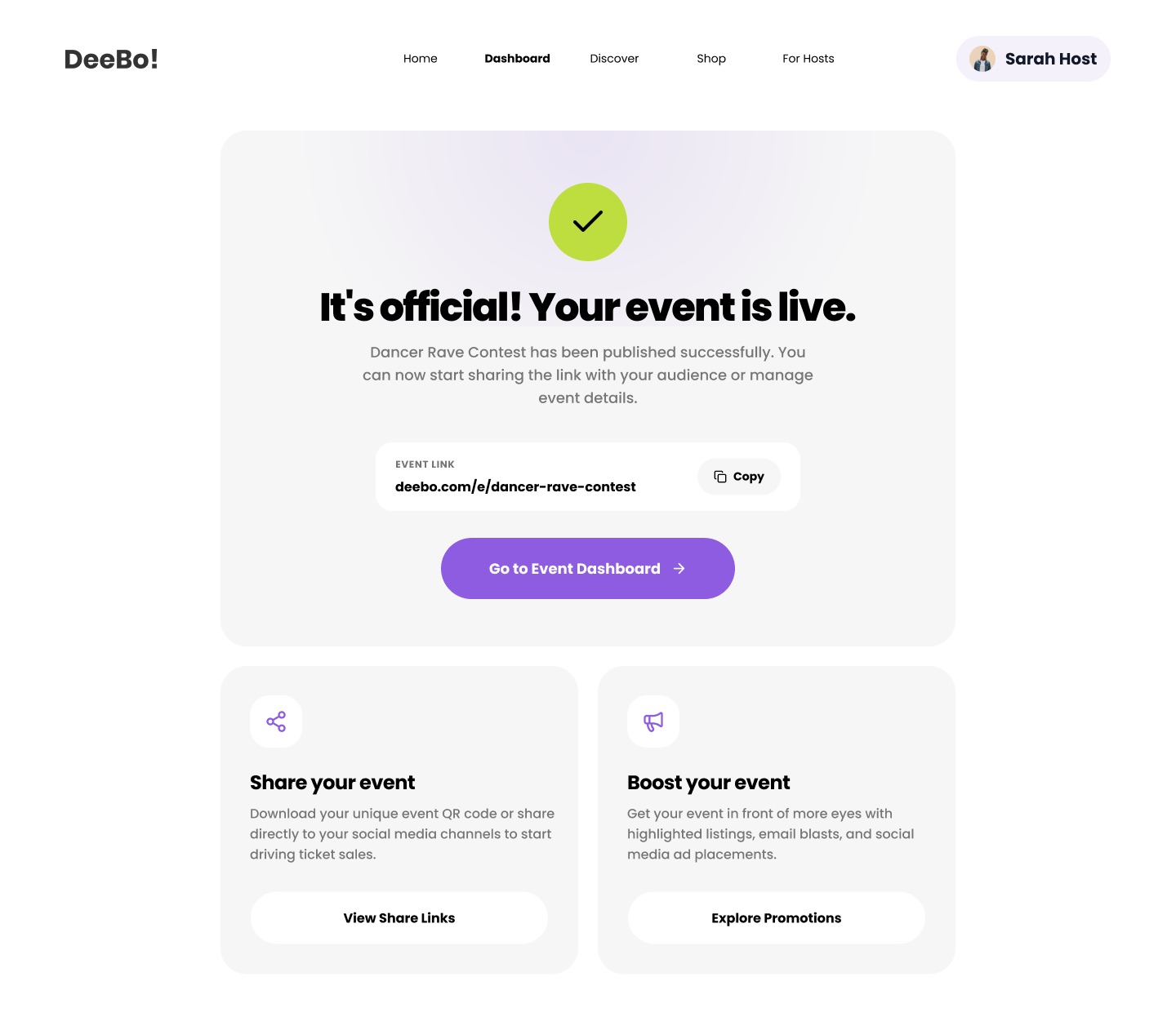
Deebo is an event discovery and ticketing platform for Nigeria. I designed it, built it and took it live, with AI keeping the path from design to launch short.

My role
Product design, engineering, launch
Platform
Responsive web app
Focus
Event discovery, ticket purchase, host tools

Design

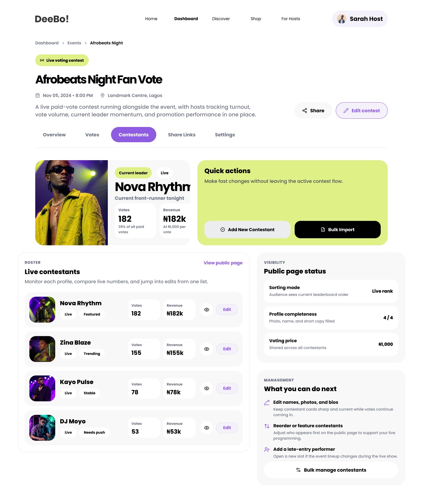
I shaped the whole journey, from “what’s on near me” to a ticket in hand. I started discovery from the city a person is in, kept one colour for every primary action so the next step is always obvious, and designed a single event card that holds up from a phone to a wide desktop. I designed the host side as well, so organisers and guests feel they are using one product.

Build

I built it myself, using AI to turn designs into working code in days rather than weeks. Everything grows from a system of design tokens I defined for colour, type, spacing and light and dark themes. I made the pages fast to load and easy to find in search, and I made every menu, dialog and form work by keyboard and with a screen reader. Because I build what I design, the details in my mockups are the details in production.

Ship

I took it through launch: installable to a phone’s home screen, event links that share with proper previews, and the measurement I need to see where people hesitate. Shipping was the start. I keep refining it from what real use shows me.

What this project shows

  • End-to-end ownershipI can take a product from the first sketch to production on my own, quickly, with nothing lost in a handoff.
  • Systems thinkingI design in systems, not screens, which keeps a growing product consistent and quick to extend.
  • Product judgementI know which details make buying a ticket feel effortless, and I can build them myself.

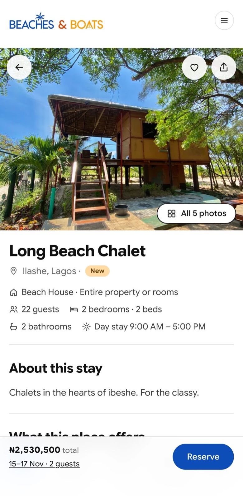
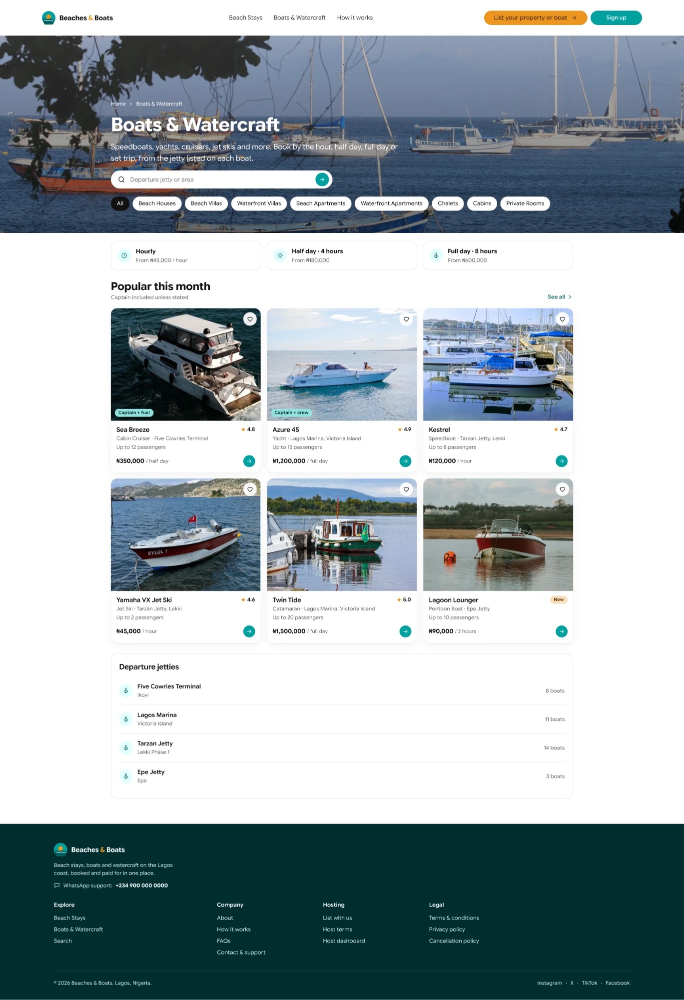
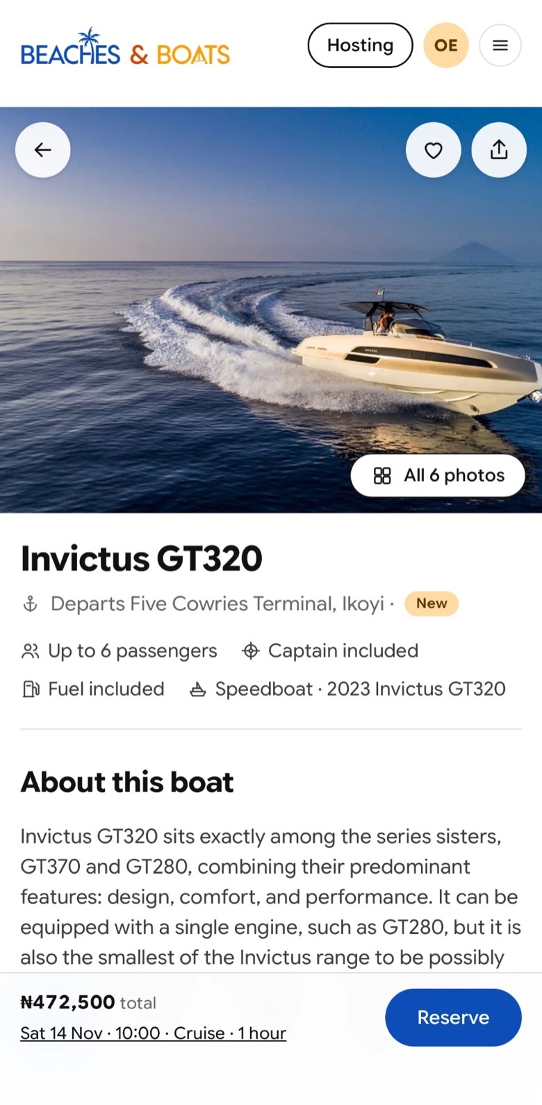
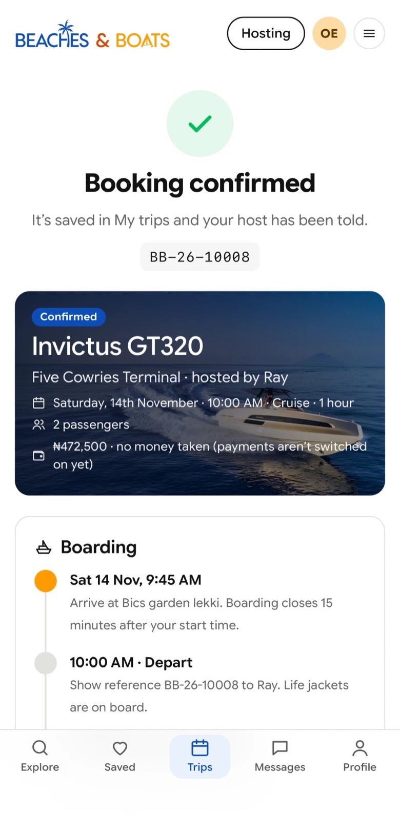
Beaches and Boats website

Boat and stay bookings

Visit site

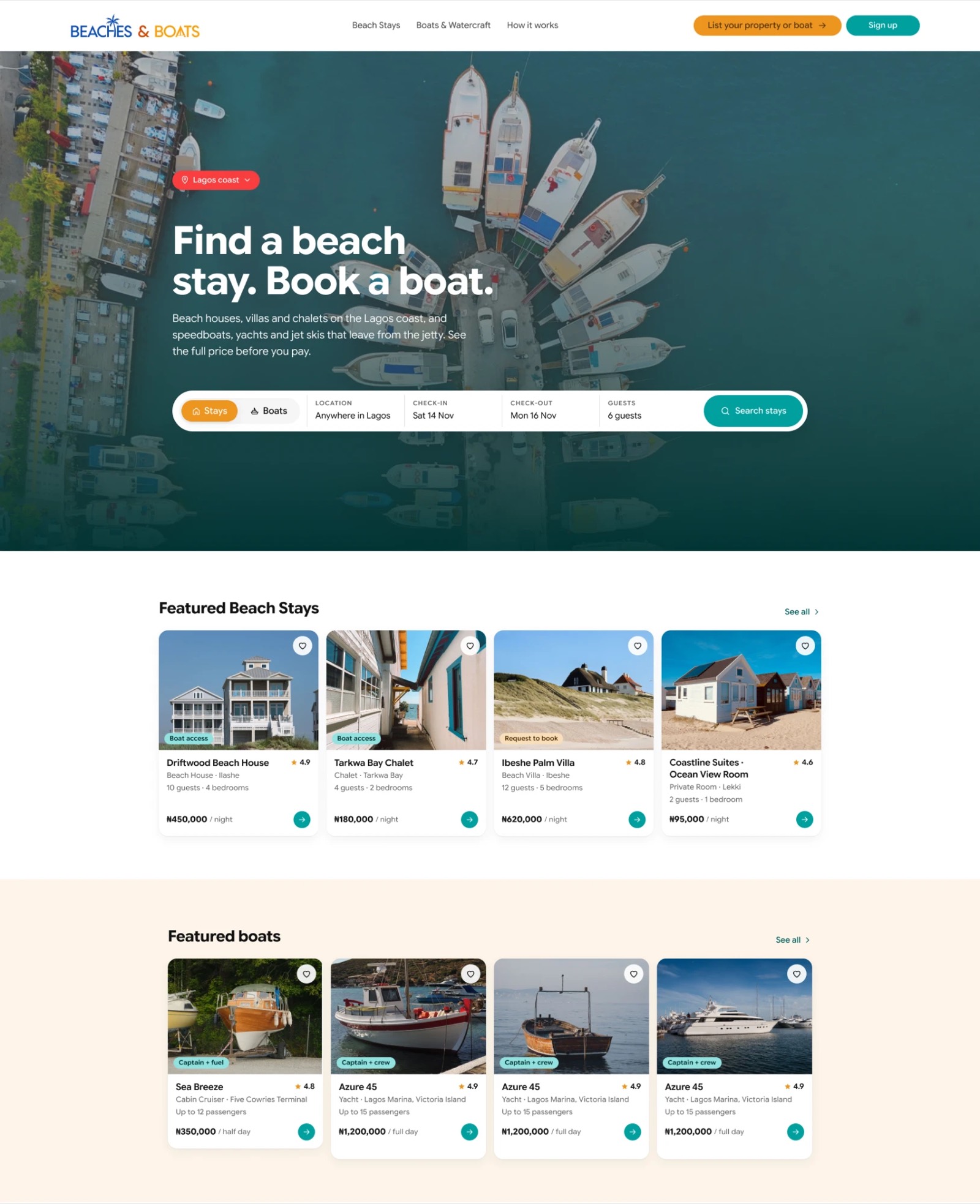
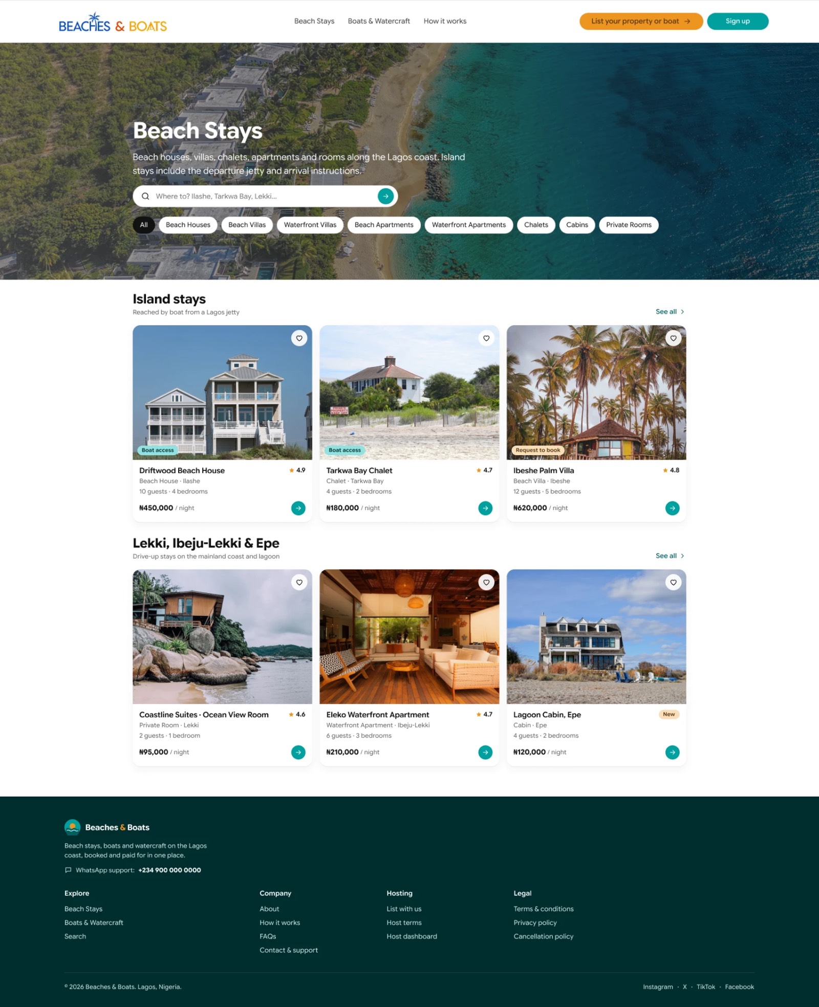
Swipe or use the arrows to change page. Scroll inside the screen to explore the live site.

Beaches and Boats is a booking marketplace for beach stays and boats on the Lagos coast. I designed it and built it end to end.

My role
Product design, engineering, launch
Platform
Mobile-first web app
Focus
Search, listings, booking flow

Design

Most people plan a beach trip on their phone, so I designed for the phone first and let the desktop grow from it. I worked out how to present two very different things, a place to stay and a boat to hire, in one consistent pattern, and how to show the full price before anyone commits. I made the booking flow ask for one decision at a time.

Build

I built it to be light and fast, which keeps it quick on mobile data, and AI in my workflow got it from design to a working product quickly. I wrote the motion myself, so screens move the way people expect on a phone, and I made sure a booking in progress is never lost, even when someone has to sign in halfway through. It installs to the home screen and behaves like an app.

Ship

I set up separate spaces for guests, hosts and administrators, link previews for every listing, and the measurement needed to learn from real use. I handled the unglamorous parts too: loading and empty states, accessibility, and behaviour on a slow connection.

What this project shows

  • Mobile-first product designI design for the device people actually use, then scale up, not the other way round.
  • Engineering restraintI choose the right amount of technology for the job, so the product stays fast and simple to maintain.
  • Care for the whole flowI design and build the edges as carefully as the centre: sign-in detours, slow networks, empty results.

Hybrid Sports Club

Community site, RSVPs and merch store

Visit site

Swipe or use the arrows to change page. Scroll inside the screen to explore the live site.

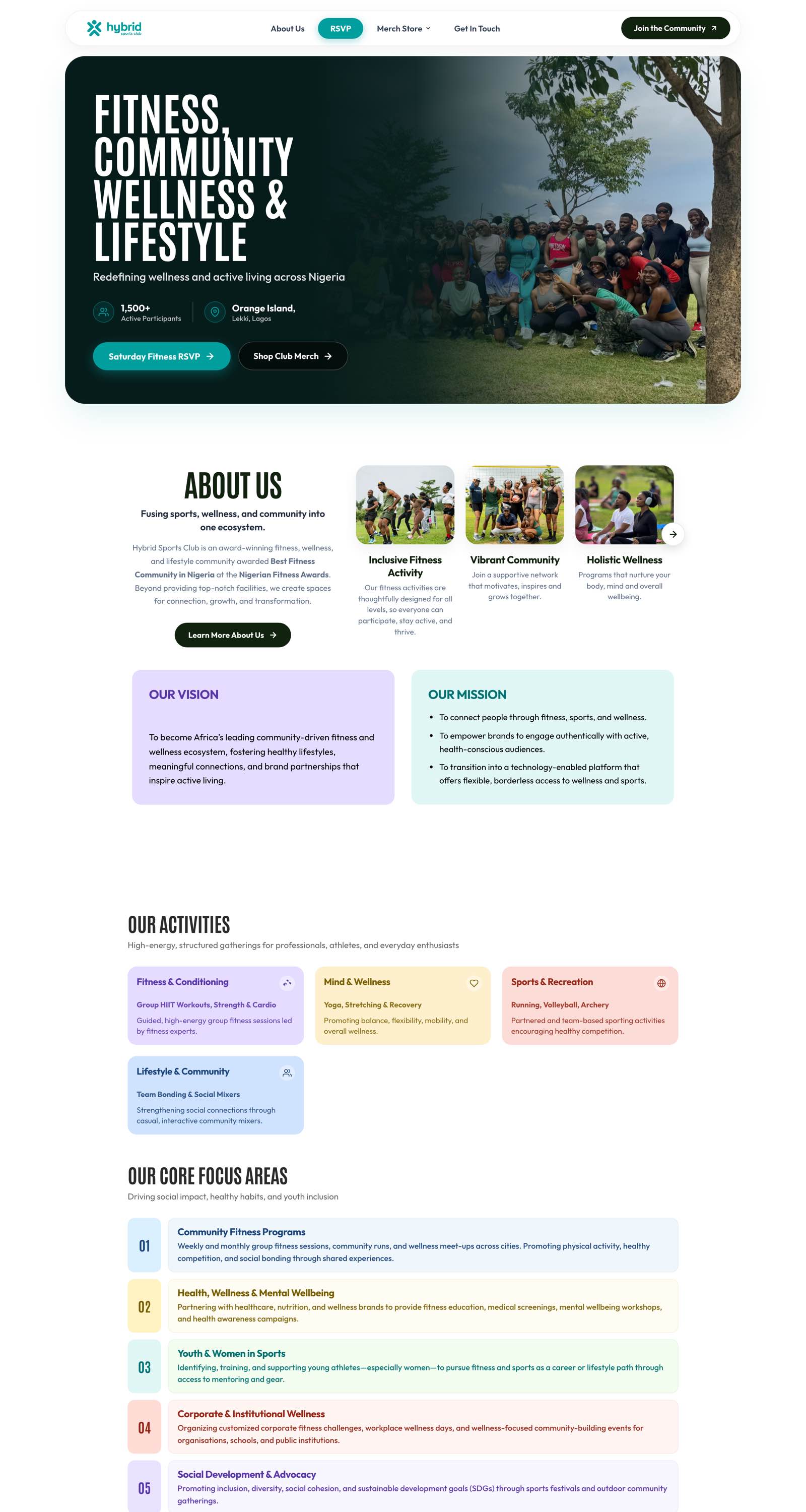
Hybrid Sports Club is a fitness and lifestyle community in Lagos. I designed and built its website, its weekly RSVP system and its merchandise store.

My role
Design, build, launch
Platform
Responsive web
Focus
Brand site, RSVPs, online store

Design

I gave the club a bold, energetic presence on the web: strong condensed headlines, a teal and deep-green palette, and colour-coded cards that make its activities easy to scan. I arranged the home page to answer a newcomer’s questions in order: what this is, what happens, who comes, and where to meet.

Build

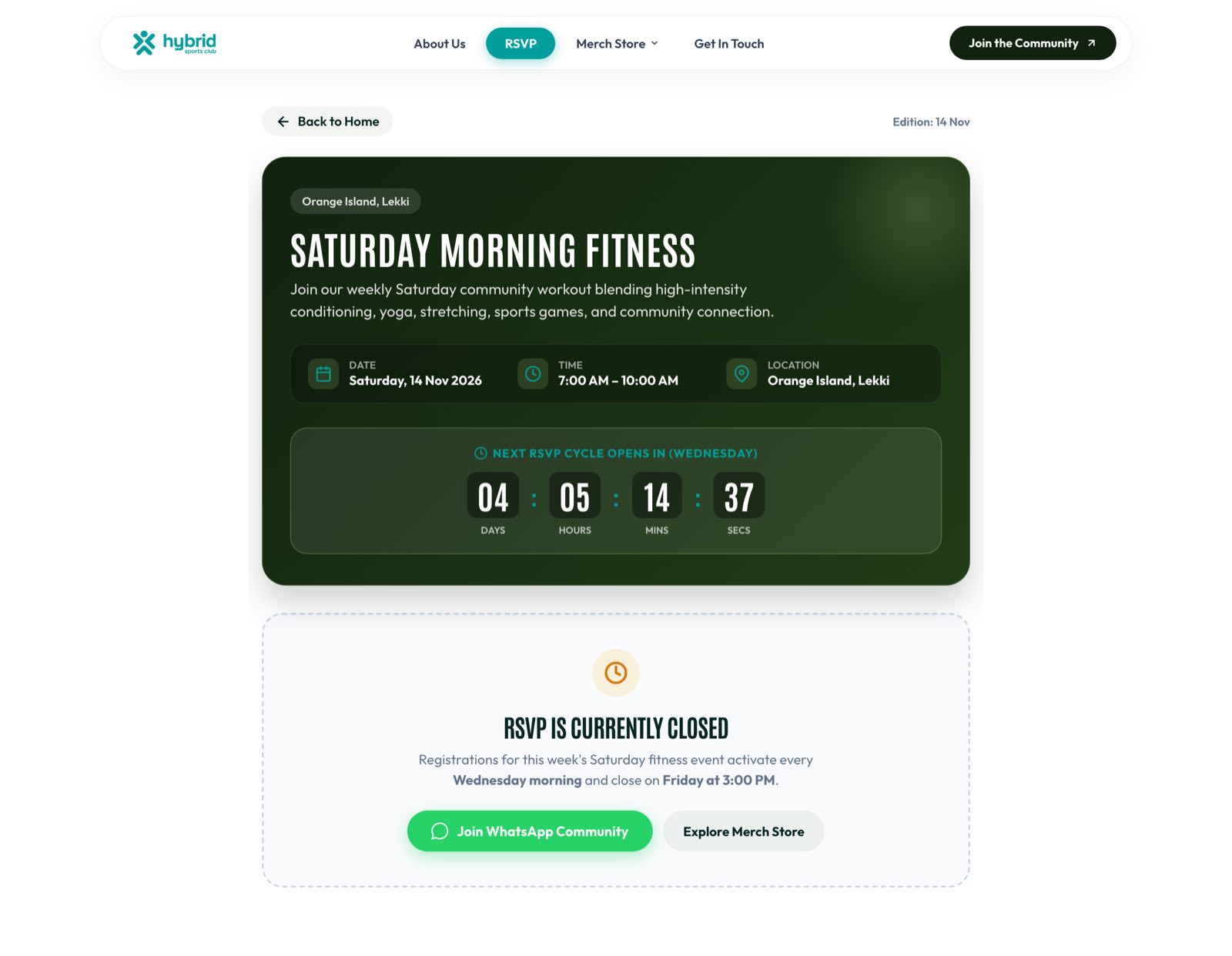
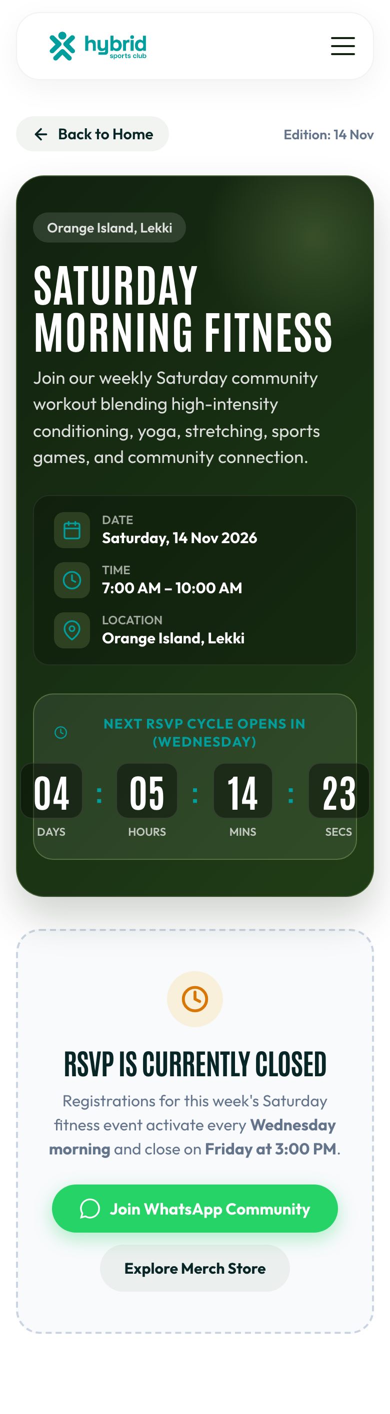
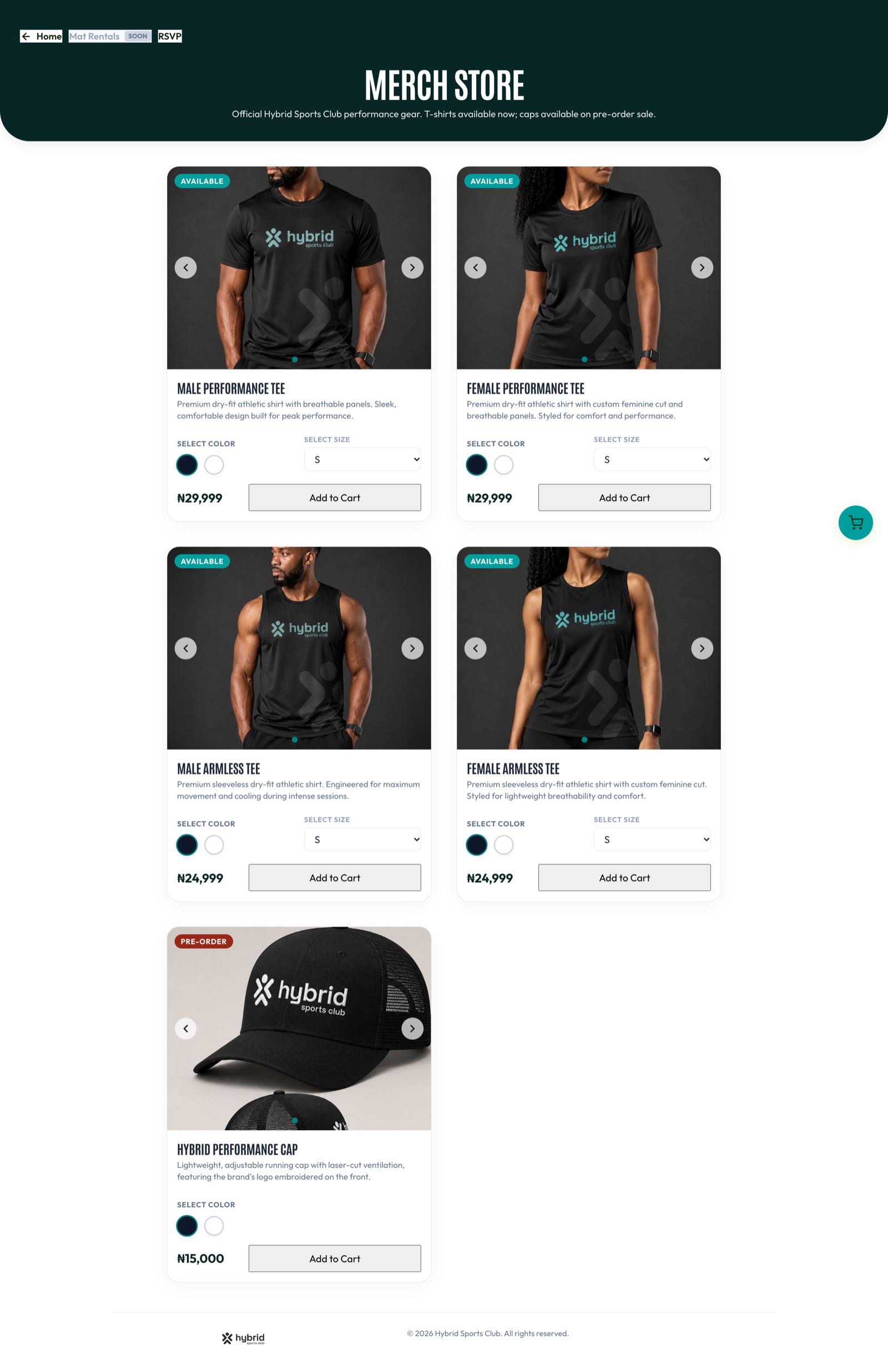
I built it to be light and fast, with AI speeding up the work, then added the working parts a community needs: an RSVP flow that issues a ticket and a calendar invite, a store with product options, a cart and checkout, and pages for one-off events. I built the weekly routine to run itself, so registration opens and closes on schedule without anyone managing it.

Ship

I launched it, and it now runs the club’s week: people register, buy merchandise and find the next session. I built it to hold up at a crowded venue on a weak connection, because that is where it gets used.

What this project shows

  • Brand and product togetherI can give an organisation a distinctive look and the working tools behind it in one piece of work.
  • Automation that removes adminI look for the weekly chores a product can do by itself, and build them in.
  • Reliability where it countsI design for the real conditions of use, not the ideal ones.

Rethink AI

Concept landing page for an AI platform

View on Dribbble
The Rethink AI landing page, shown on a laptop screen in an orange tunnel

A design concept, not a live product.

Rethink AI is a landing page concept for a platform where experts train, build, refine and deploy agentic AI, and get paid for their expertise. I set out to make an AI brand that feels human.

My role
Concept, art direction, visual design
Platform
Web landing page
Focus
Brand direction, hero, typography
The full Rethink AI landing page
The soft-focus portrait at the centre of the hero
The headline: The future of Artificial Intelligence, with the second line in an orange italic serif
Signal orange#F47B20
AaAa
Model logos: OpenAI, Claude, Grok, Gemini and DeepSeek

Direction

I stepped away from the cool blues and purple gradients most AI brands share, and built the palette on a high-energy orange. Warmth signals people, not machines, which is the whole point of a platform that pays experts.

Hero

A soft-focus portrait sits at the centre of the page, fading into the background. It puts the human element of machine learning in front of the technology, and it gives the headline room to breathe.

Typography

I paired a light, wide sans with an orange italic serif, so “Artificial Intelligence.” reads as the moment the page turns from statement to promise. The high contrast gives it the premium feel an expert audience expects.

What this project shows

  • Brand thinking beyond the categoryI look for the visual language a market has worn out, and find a credible way out of it.
  • Composition that convertsMinimal layout and deliberate negative space lead the eye from the headline to the call to action.
  • Type as the main visualI can make a page memorable with typography and one strong image, without decoration.

Nexus AI

Multi-modal AI workspace

View on Dribbble
The Nexus AI workspace on a soft linen background

A product design concept, not a live product.

Nexus AI is a desktop workspace that pulls scattered AI workflows into one place. I designed it to treat AI as a layer you work in, not a chat box you visit.

My role
Product design, visual design
Platform
Desktop app
Focus
Workspace structure, integrations, AI persona
The full Nexus AI workspace
The Connect Apps panel with Slack, Gmail and Drive
Chat history grouped by day
A conversation that switches to image generation
Generated elephant images fanned out like photos
The 3D robot mascot asking how it can help
The prompt bar

One thread, many modes

Text, image generation and plugin tasks live in the same conversation, so switching between them never means switching tools. The mode sits quietly at the top of the thread, one tap away.

From insight to action

A Connect Apps panel links the assistant to Slack, Gmail and Drive, so a summary or a draft can become a real message without copying between windows.

A face for the assistant

A friendly 3D mascot gives the technology a presence, so working with it feels collaborative rather than robotic. It greets you without crowding the work.

What this project shows

  • Calm in a complex productA soft UI with subtle glass and shadows gives depth without clutter, so the sidebar never competes with the conversation.
  • Content firstAn off-white and charcoal palette steps back so generated work, like images, becomes the focal point.
  • Orchestration thinkingI design how many capabilities fit together, not just how each screen looks.

Snaft

Visual identity · A tale of two concepts

View on Dribbble
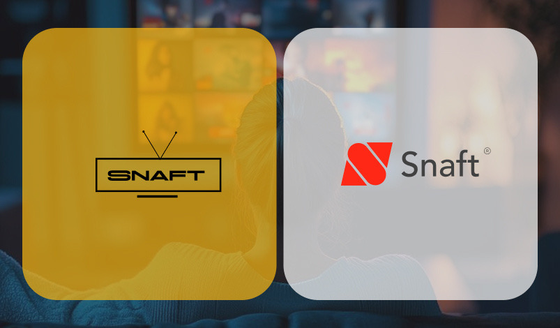
Concept 1, a retro TV wordmark on yellow, beside Concept 2, the red remote-control S

Snaft is a media platform that gives people access to television channels from anywhere in the world. I created its visual identity: a brand that feels technologically advanced and universally accessible, bridging traditional TV and borderless streaming.

My role
Brand strategy, logo design, visual identity
Industry
Media and TV streaming
Outcome
Two concepts; the client chose Concept 2

The challenge

The brand had to carry two values at once:

  • Vastness. Access to the world’s channels.
  • Ease of use. A seamless, frictionless experience.
Concept 1: a retro TV wordmark, shown on white and yellow, with vintage televisions

Concept 1

The bridge of nostalgia

Built on the emotional connection viewers have with the history of television. The logo whispers nostalgia while delivering modern access: TV’s past, unlocked for a global future.

A clean, typographic mark that feels authoritative yet welcoming, putting the brand’s story ahead of the app’s mechanics. Classic, trustworthy, cinematic.

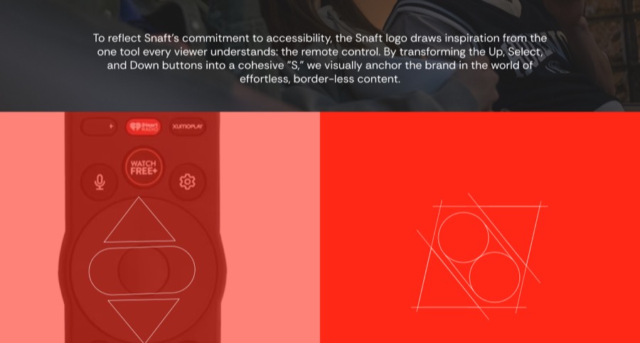
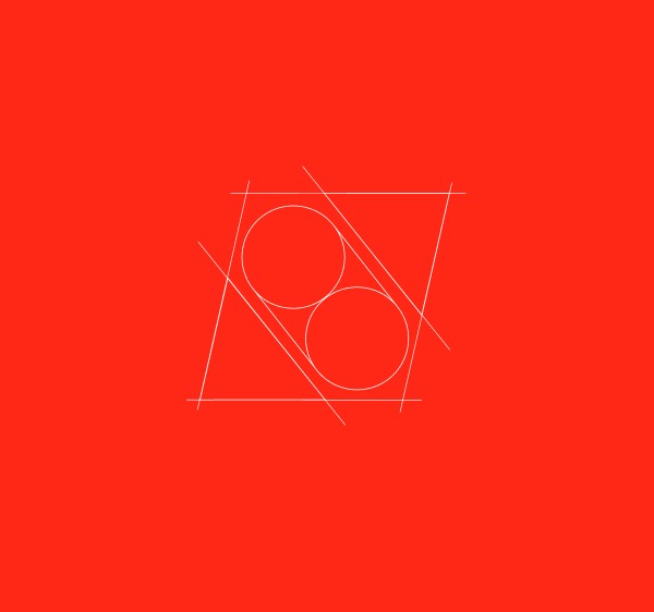
Concept 2: the S mark built from remote-control buttons, its construction grid, and the primary and secondary lockups

Concept 2 Client’s choice

The interface of accessibility

To anchor the brand in effortless navigation, I looked at the most universal tool in media: the remote control. The “S” is built from its three most essential buttons.

  • Up and Down stand for discovering channels and the size of the library.
  • Select, in the centre, is the moment of choice.

Merged, they make a letterform that works as a functional icon and a quiet cue for control.

The verdict

The client chose Concept 2. The remote “S” captured the utility of their product, and because every TV viewer already understands the metaphor, the brand felt familiar and easy to navigate from day one.

Both directions solve the problem, one through storytelling and the other through function. That is how I approach identity work: more than one honest answer, and a clear reason to choose.

Deebo

Brand identity and guidelines

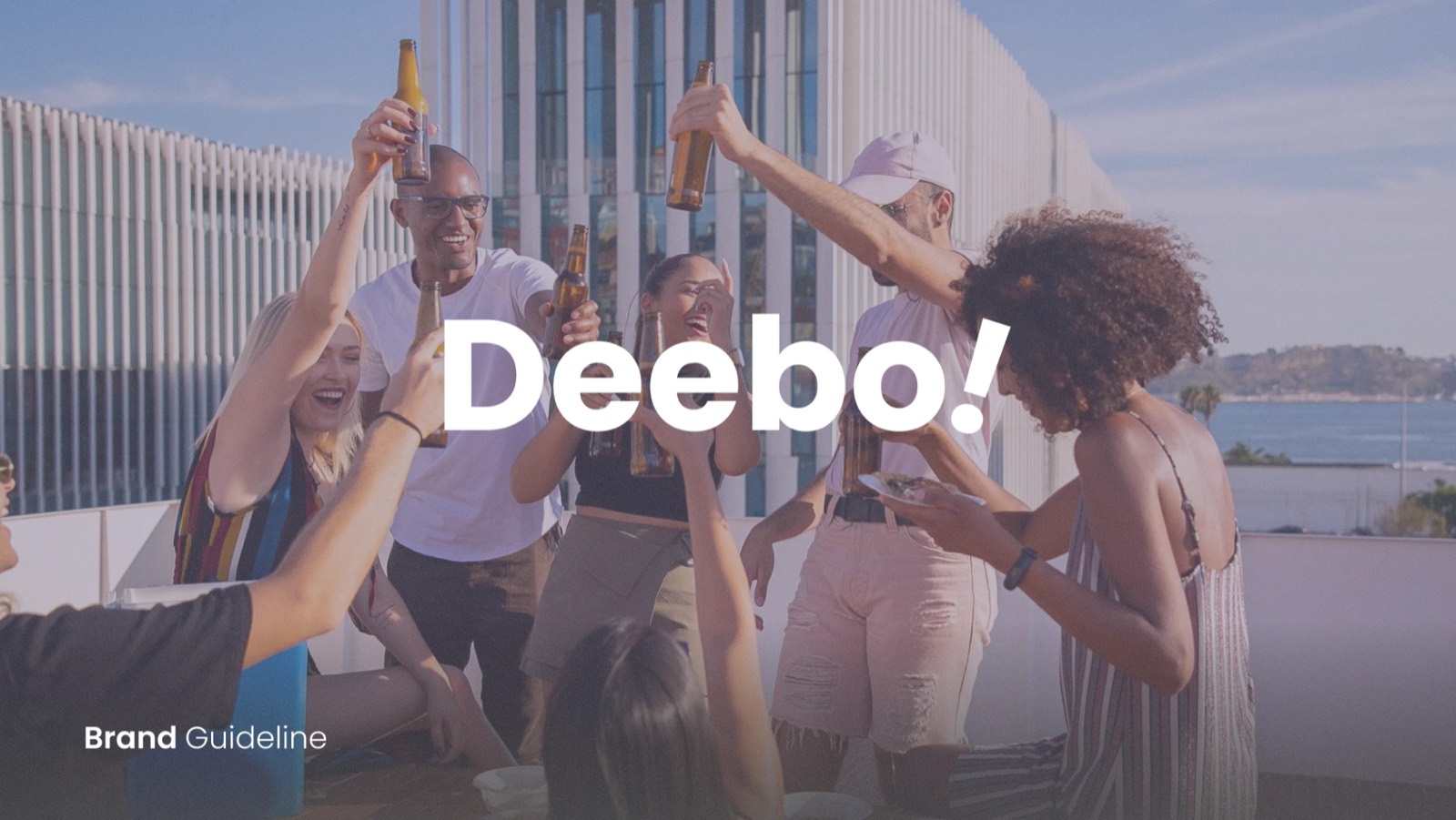
The Deebo wordmark over friends raising a toast on a rooftop

Deebo is a platform for people who create experiences and people who live for them: event discovery, ticketing, contests and e-voting in one place. I built its identity and wrote the guidelines that keep it consistent across every screen and poster.

My role
Naming story, logo, visual identity, brand guidelines
Industry
Events, ticketing and e-voting
Deliverables
Wordmark, app icon, colour, typography, core values

A name with a vote in it

Deebo, pronounced /dɪˈboʊ/, comes from the Yoruba word “Di’bo”, which means “to vote”. It puts participation at the heart of the brand, because on Deebo people don’t just attend: they pick the winners. The exclamation mark makes the name sound like what it is, an invitation to join in.

Logo and app icon

A heavy, rounded wordmark that finishes on a slanted exclamation, set in a stacked “Dee Bo!” for the app icon so it stays bold at the smallest size. Each version is tested on purple, lime, black and white.

The Deebo app icon on purple, black and white The Deebo wordmark on lime, black, white and purple backgrounds

Colour

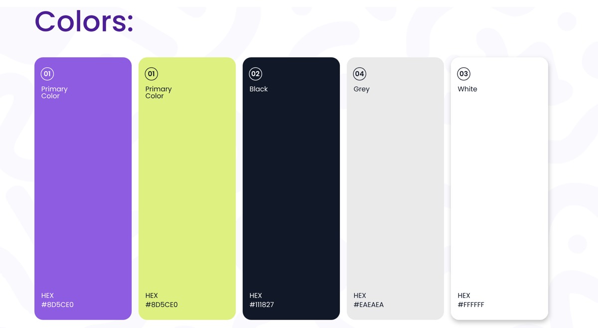
An electric purple and a fresh lime lead the palette: the energy of a night out, with enough contrast to stay legible on a crowded event poster. A deep near-black, a soft grey and white do the quiet work of interfaces and text.

Deebo colour swatches: purple, lime, black #111827, grey #EAEAEA and white

Typography

Poppins throughout: geometric and friendly, clear in a ticket list and confident in a headline like “Good days begin here”. One family across headline, subtitle and body keeps the voice consistent.

Deebo typography: Poppins in headline, subtitle and body sizes

Core values

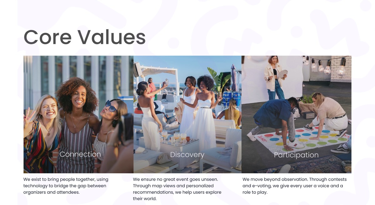
Deebo core values photography: connection, discovery and participation
  • Connection. Bringing people together, with technology bridging organisers and attendees.
  • Discovery. No great event goes unseen: map views and personal recommendations help people explore their city.
  • Participation. Beyond watching: contests and e-voting give every guest a voice and a role to play.

The result

A brand that feels like the moment before a great night out, and a set of guidelines that let anyone on the team use it correctly. It also became the foundation for the Deebo product I designed and built, which you can see in my work.

Delmar

Brand identity and guidelines

The Delmar wordmark on orange, beside a tyre-track pattern made from the mark

Delmar is a renewable energy company with a simple promise: keeping power. I designed its identity and the guidelines that carry it from a business card to a billboard to a company car, so it looks like one confident company wherever it shows up.

My role
Logo, visual identity, brand guidelines, applications
Industry
Renewable energy
Deliverables
Logo system, colour, typography, brand perception, collateral

The mark

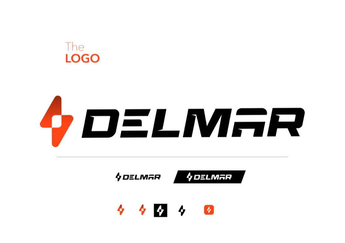
A lightning bolt drawn as a single, decisive shape, paired with an extended, angled wordmark that looks built for speed. The system works full size, as a compact lockup, reversed out of black, and as a standalone icon small enough for an app or a lapel.

The Delmar logo, compact lockups and icon variations

Colour and type

One saturated orange carries the brand: warm, energetic and impossible to miss on a street. Black and white do everything else. Avenir Next gives a clean, modern voice for headlines and interfaces, and Athelas, a classic serif, adds a touch of credibility in longer text.

Delmar colours: orange #FF4D00, black and white Delmar fonts: Avenir Next and Athelas

How it should feel

Four words guide every decision: innovative, premium, eco-friendly and durable. The guidelines pair each with imagery, so anyone briefing a photographer or an agency starts from the same feeling.

Delmar brand perception board: innovative, premium, eco-friendly, durable

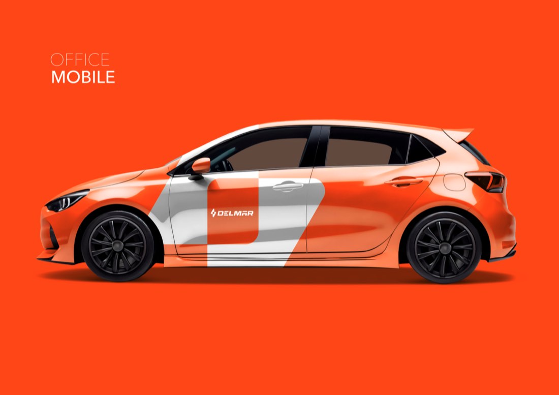
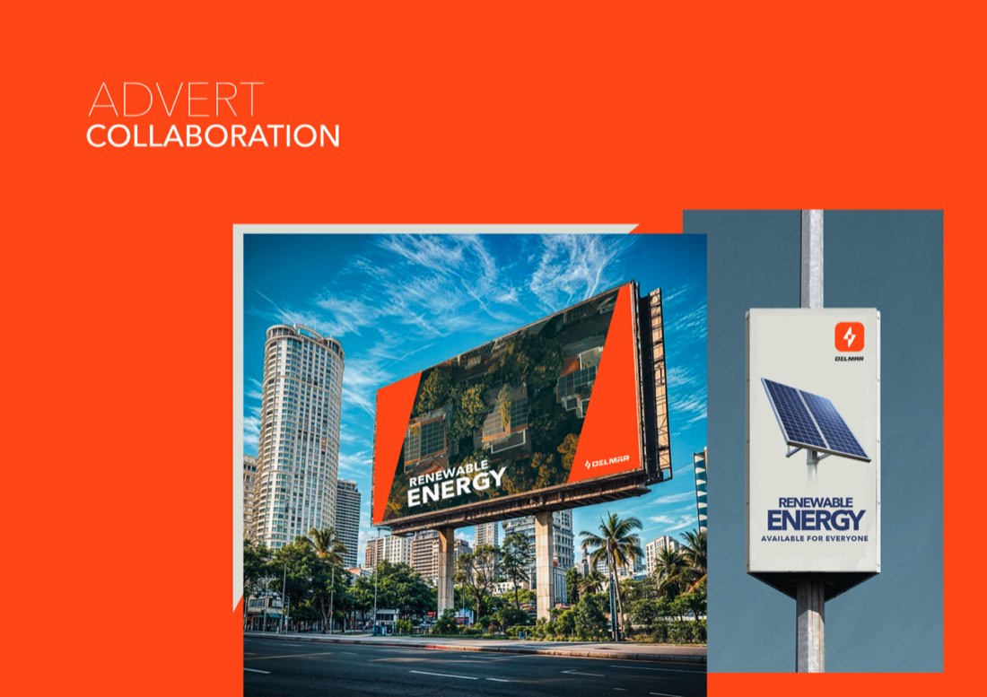
In the world

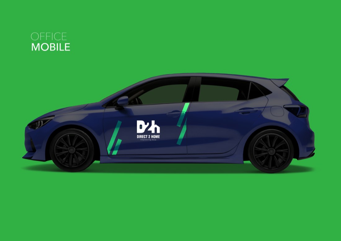
I took the identity through everything the business touches day to day, to prove the system holds up.

The result

A brand that feels as dependable as the power it sells, with guidelines clear enough that a print shop, a sign maker and a car wrapper can each get it right first time.

D2H · Direct 2 Home

Brand identity and guidelines

The D2H brand manual cover over a field of solar panels

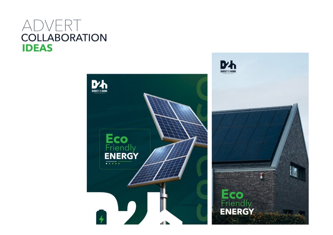
Direct 2 Home delivers clean, reliable energy straight to Nigerian homes. Its line is “Empowering Naija”. I designed an identity where the logo itself tells that story, and wrote the brand manual that keeps it consistent.

My role
Logo, visual identity, brand manual, applications
Industry
Home and solar energy
Deliverables
Logo system, symbolism, colour, typography, collateral

A logo that explains the business

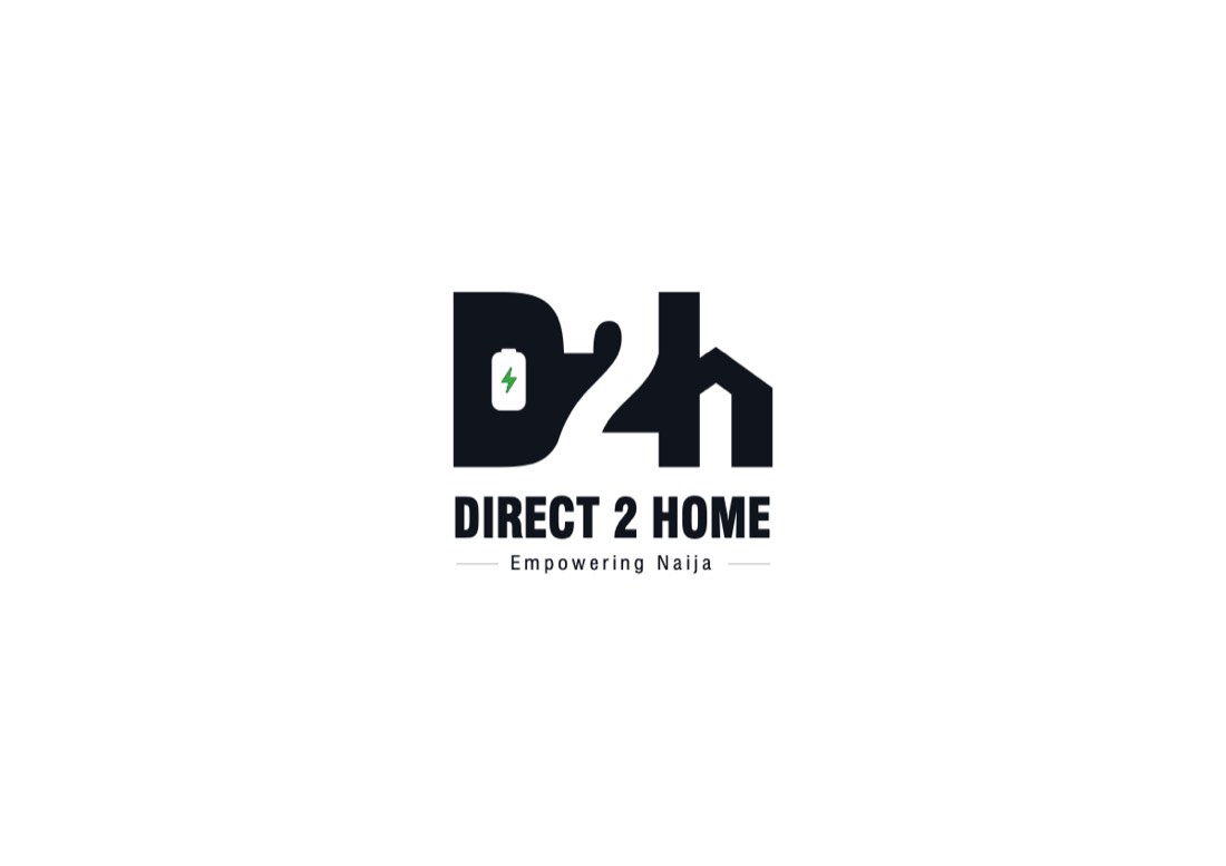
The mark merges D, 2 and H into one shape, using negative space.

  • The D is shaped like a plug or an appliance, with a battery and a lightning bolt inside: energy, technology and a direct utility service.
  • The 2 sits at the centre, the “to” in Direct to Home.
  • The H is drawn as the outline of a house: residential delivery, reliability and the comfort of home.

Set beside it in Swiss 721 Black Condensed, the name reads strong and compact, with “Empowering Naija” beneath.

D2H logo symbolism: plug, 2 and house combining into the mark, plus logo usage on navy, green and white

Colour and type

Green for clean energy and growth, a deep navy for trust and stability, and black for detail. Swiss 721 Condensed handles headlines and calls to action, Avenir Next the body copy, and Athelas the captions and fine print.

D2H colours: green #4DB848, navy #0B182E and black D2H fonts: Swiss 721 Condensed, Avenir Next and Athelas

How it should feel

Innovative, consumer-friendly and eco-friendly: modern technology that still feels warm and approachable to a family choosing a power solution.

D2H brand perception board: innovative, consumer friendly, eco friendly

In the world

The result

An identity a customer can understand at a glance, power delivered to your home, and a manual that keeps it consistent from the van on the street to the card in your hand.